Letro app
Led the end-to-end UI/UX design and the brand identity of Letro, an offline alternative to email.
Led the end-to-end UI/UX design and the brand identity of Letro, an offline alternative to email.
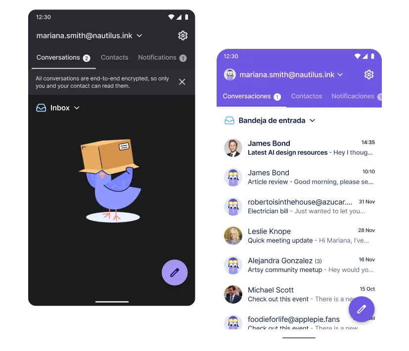
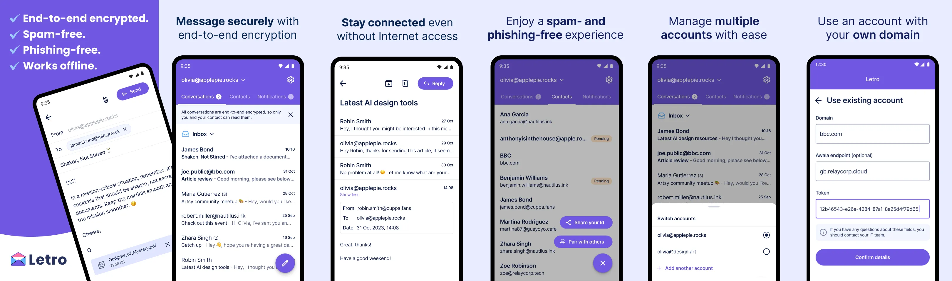
Letro is an offline alternative to email, designed to circumvent internet shutdowns. Unlike email, Letro offers end-to-end encryption, eliminates phishing and spamming, and users can send and receive messages without access to the Internet.
I led the end-to-end UX/UI and brand design for Letro, including:
Figma, FigJam, Maze, Illustrator, After Effects, Lottie, Jira, Android Studio, Slack, Loom.
2024
Lead Product Designer, Lead Developer, Android Developer.
Android
People around the world are subject to Internet or telecommunications blackouts due to government orders or conflict, rendering them disconnected from the outside world. As an offline alternative to email, Letro would change that by enabling users to send and receive messages without the internet.
The main goal was to design a messaging experience that not only works intuitively, but also feels trustworthy and a delight to use.
Due to the sensitive nature of the target audience, I conducted anonymous interviews and user testing with proxy users and one real user from targeted regions. This revealed crucial insights:
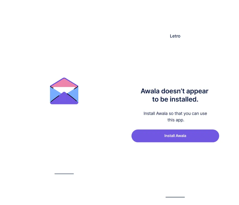
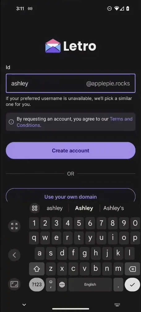
Letro depends on Awala to exchange data without the internet, requiring users to have both apps installed. Working with the lead developer, we designed an onboarding flow that automatically detects if Awala is installed.
This approach helped us educate users on the relationship between the two apps without technical jargon, and reduce installation drop-off through contextual guidance.
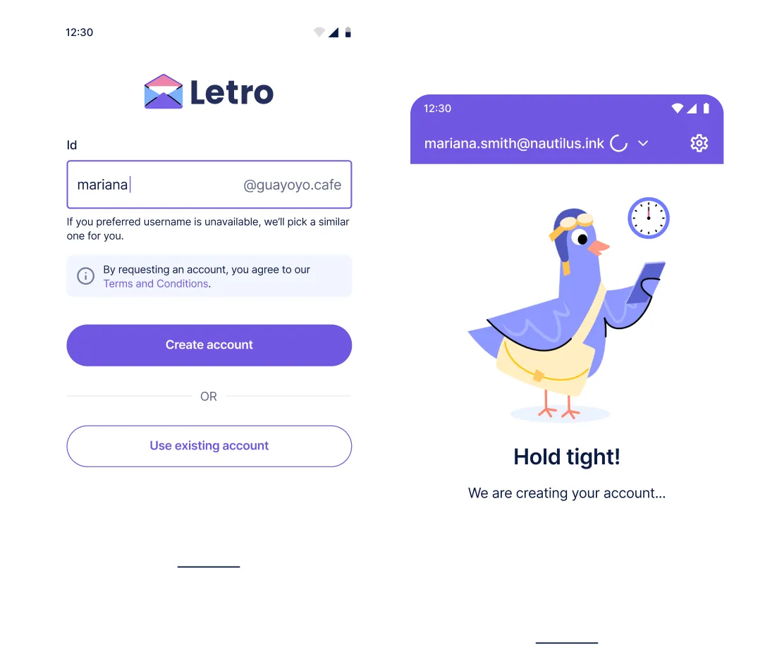
In close collaboration with the lead developer, we designed an onboarding flow that eliminated email or SMS verification as neither would work during telecommunications blackouts. Instead, users create accounts with just a username paired with a localised domain (e.g., @guayoyo.cafe in Venezuela). This approach enabled us to:
Every interaction needed to function reliably both online and offline, without depending on real-time feedback or server validation, so I partnered with the team to understand the technical limits and together design the UX for the asynchronous communication.
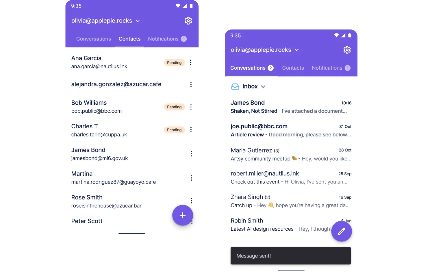
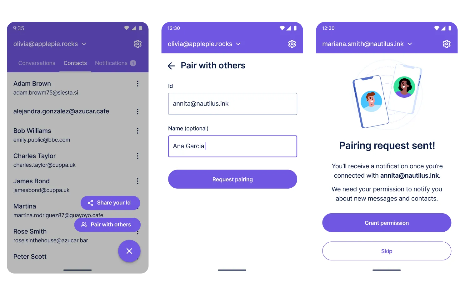
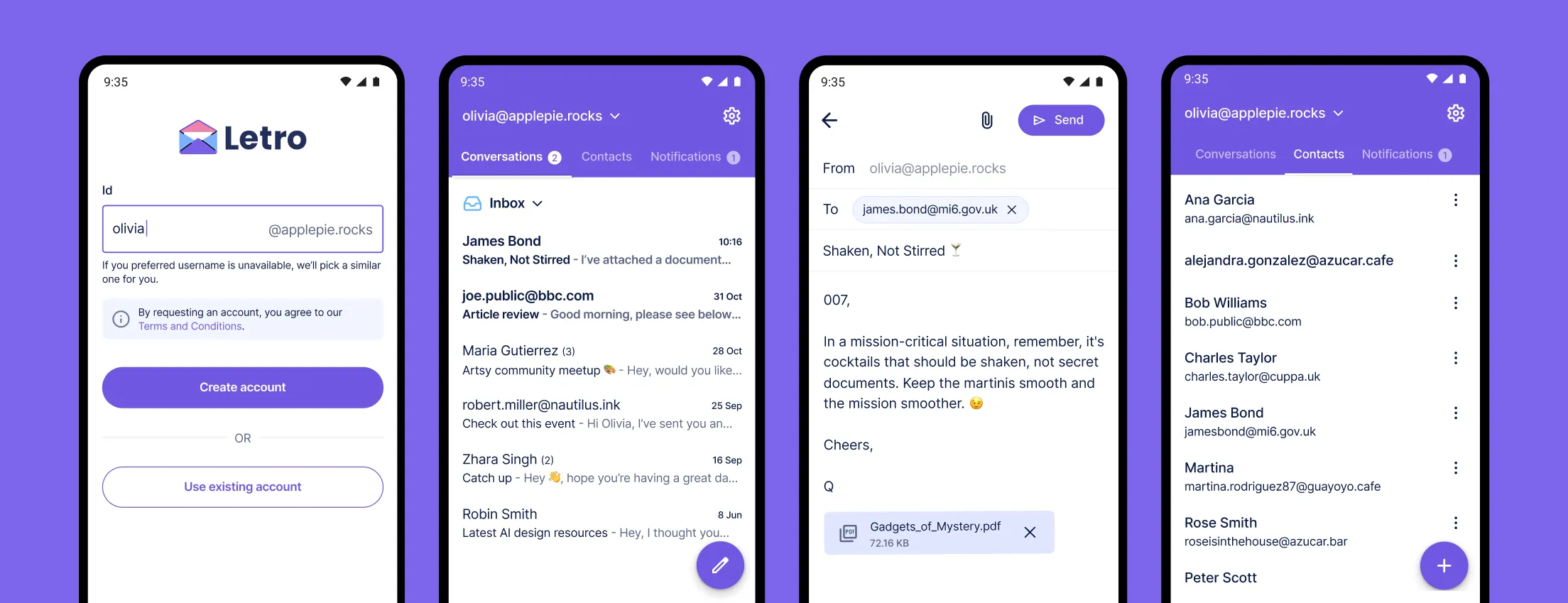
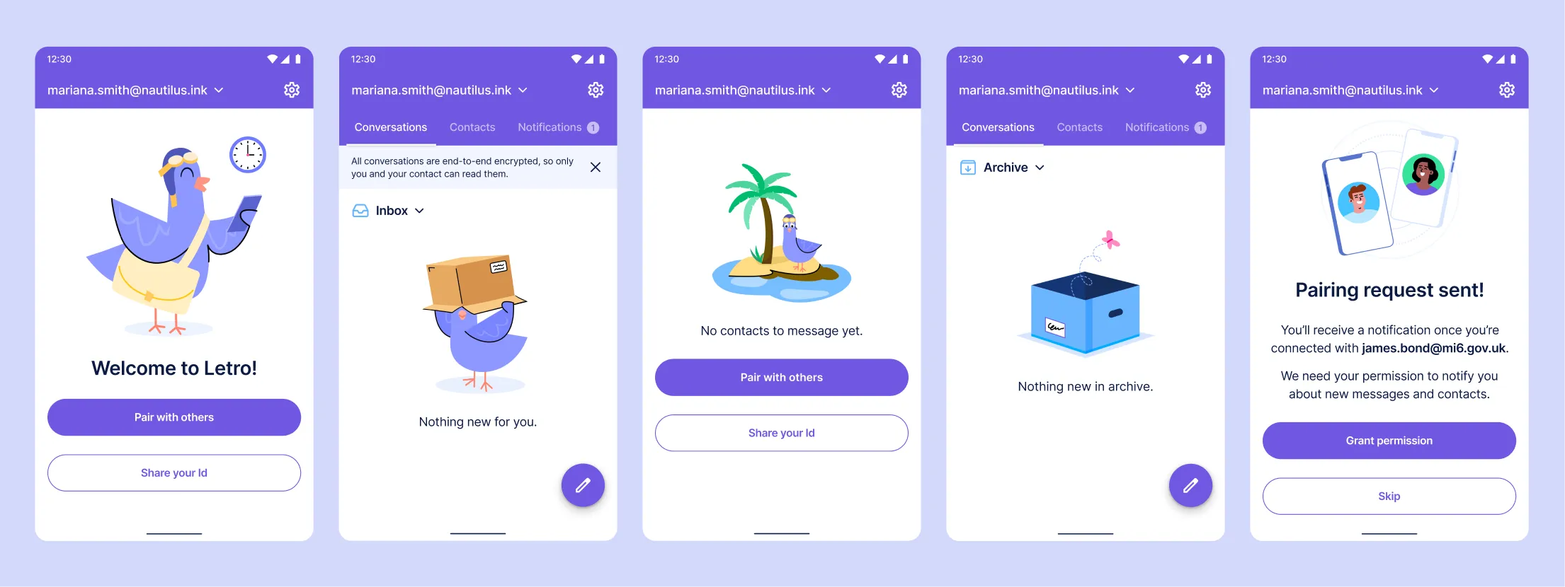
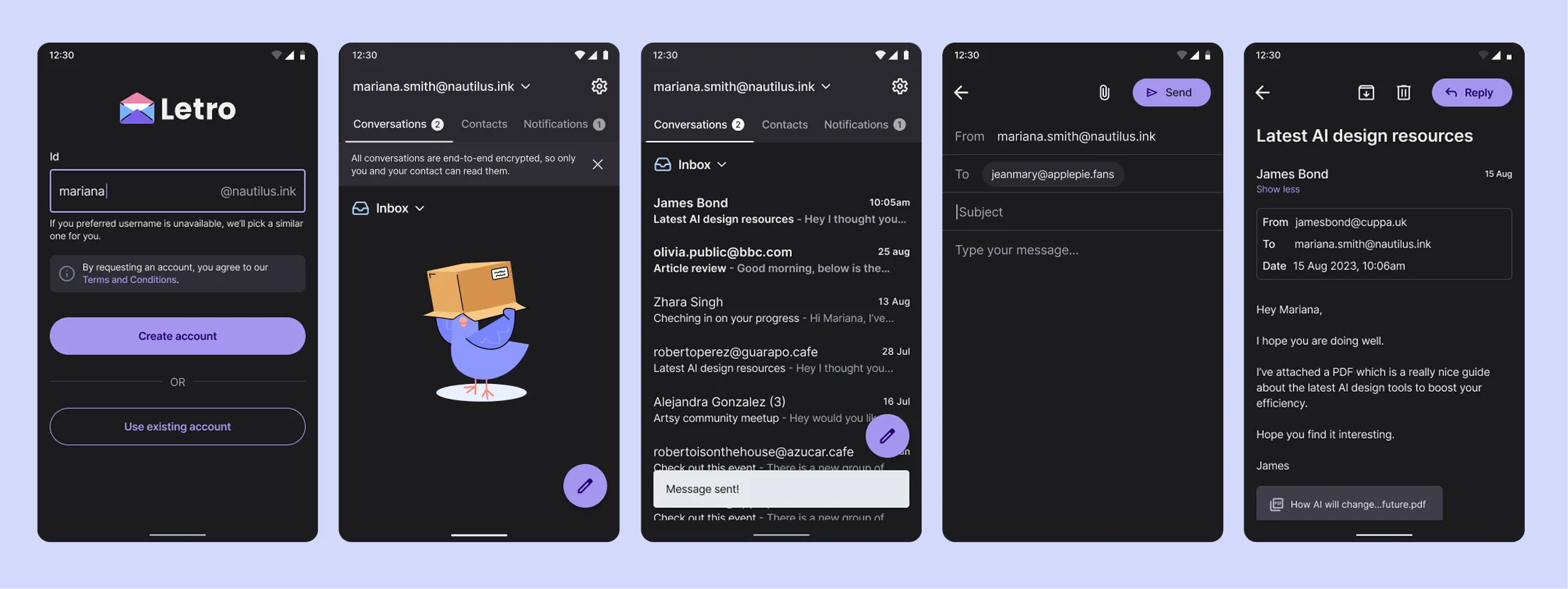
To avoid spam and phishing, especially when at-risk users are targeted, Letro required users to authorise each other upfront, before they can send messages for the first time.
We developed a streamlined pairing flow that loosely resembled "adding contacts" on some social media apps, whereby each user would simply enter the other's identifier, and the pairing would be completed once there was a match.
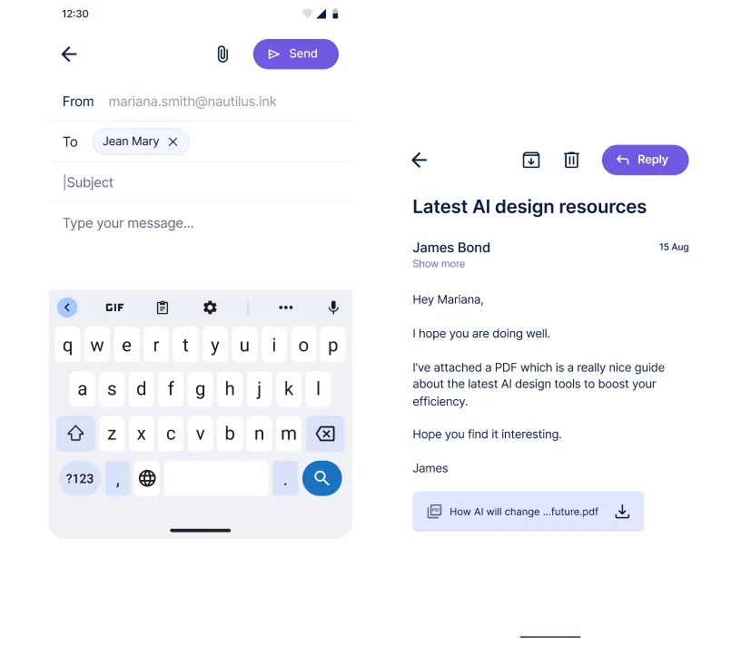
During the user testing, I found that some users found icon-only actions (like the paper plane for "send" in Gmail) confusing.
Instead, Letro uses explicit labels with supporting icons on primary CTAs, such as the "Send" and "Reply" buttons, to reduce ambiguity.
Letro was localised into several languages, so I designed the UI to support variable-length text, right-to-left (RTL) layouts, and readable fonts across different scripts. I also ensured:
Letro's visual identity was designed to feel friendly, calm, and trustworthy, qualities often missing in apps associated with surveillance-heavy or politically tense contexts.
I created illustrations including a custom bird mascot to guide users visually, adding warmth and playfulness. A calming color palette, clean typography, and purposeful microinteractions all worked together to make the experience approachable without downplaying its seriousness.
Two actions in particular could take a long time depending on device characteristics and network conditions, so I designed animations to assure them that progress is happening in a friendly way.
Which could take up to 15 seconds in the oldest devices we tested.
Which could take around 6 seconds on a slow connection, or weeks in the most extreme cases when the Internet is unavailable.
To support user comfort and extend accessibility, I also designed a dark theme. Both light and dark themes adhere to a consistent visual system: clear iconography, generous spacing, and scalable typography, all optimised for low-end Android devices.
I also designed the app's Google Play Store listing to reflect the app's core values of privacy, security, and trustworthiness.
To ensure platform-native usability and speed up development, I followed Material Design guidelines throughout the UI, aligning components and interaction patterns with Android standards.
Letro was a challenging yet rewarding project that offered significant opportunities for growth. Through user testing of the final prototype, I was able to validate core design assumptions, identify edge cases early, and help align the team around a user-first approach to offline communication. This process reduced risk and laid a strong foundation for future development.