Fleet dashboard onboarding redesign

Led the redesign of the EV onboarding flow in ev.energy’s B2B fleet dashboard, resulting in a 30% increase in user satisfaction and a 35% decrease in onboarding time.

Fleet Dashboard

Project overview

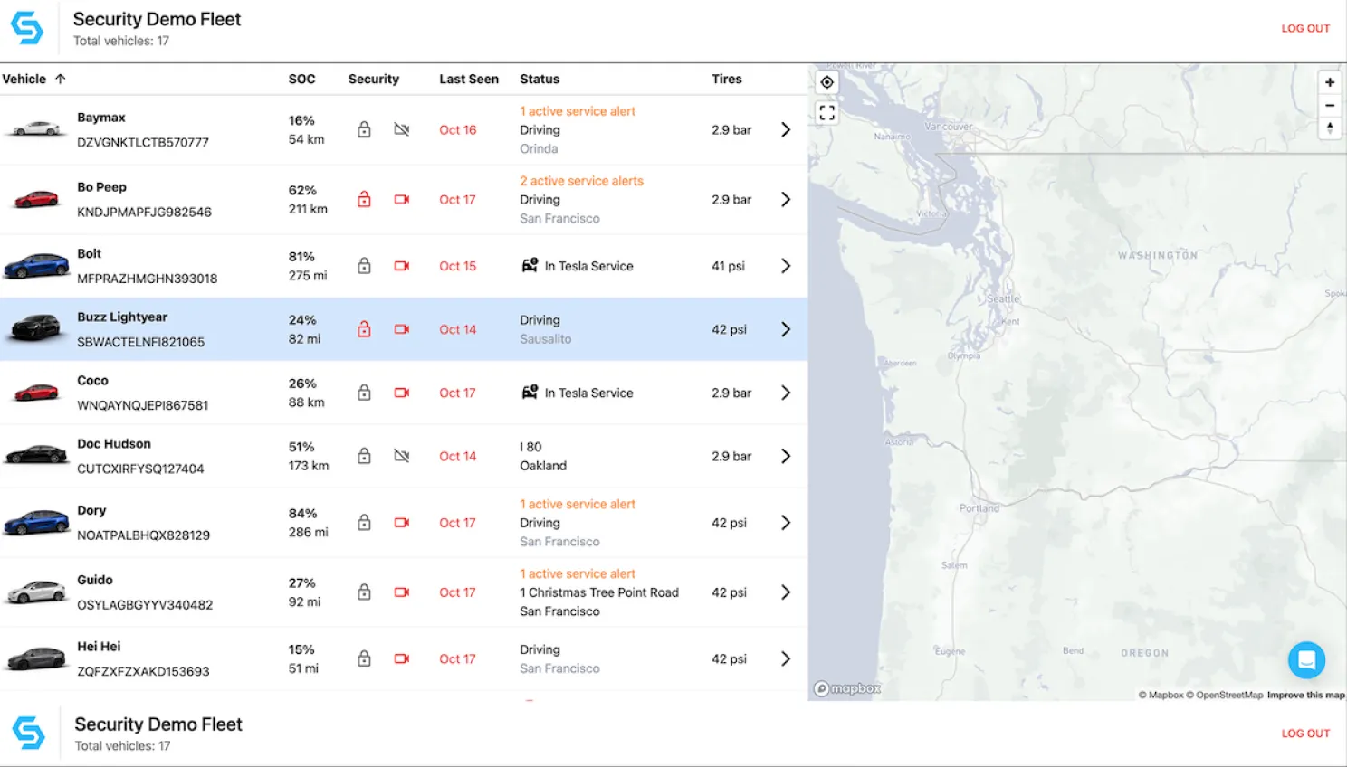
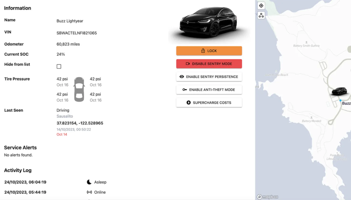
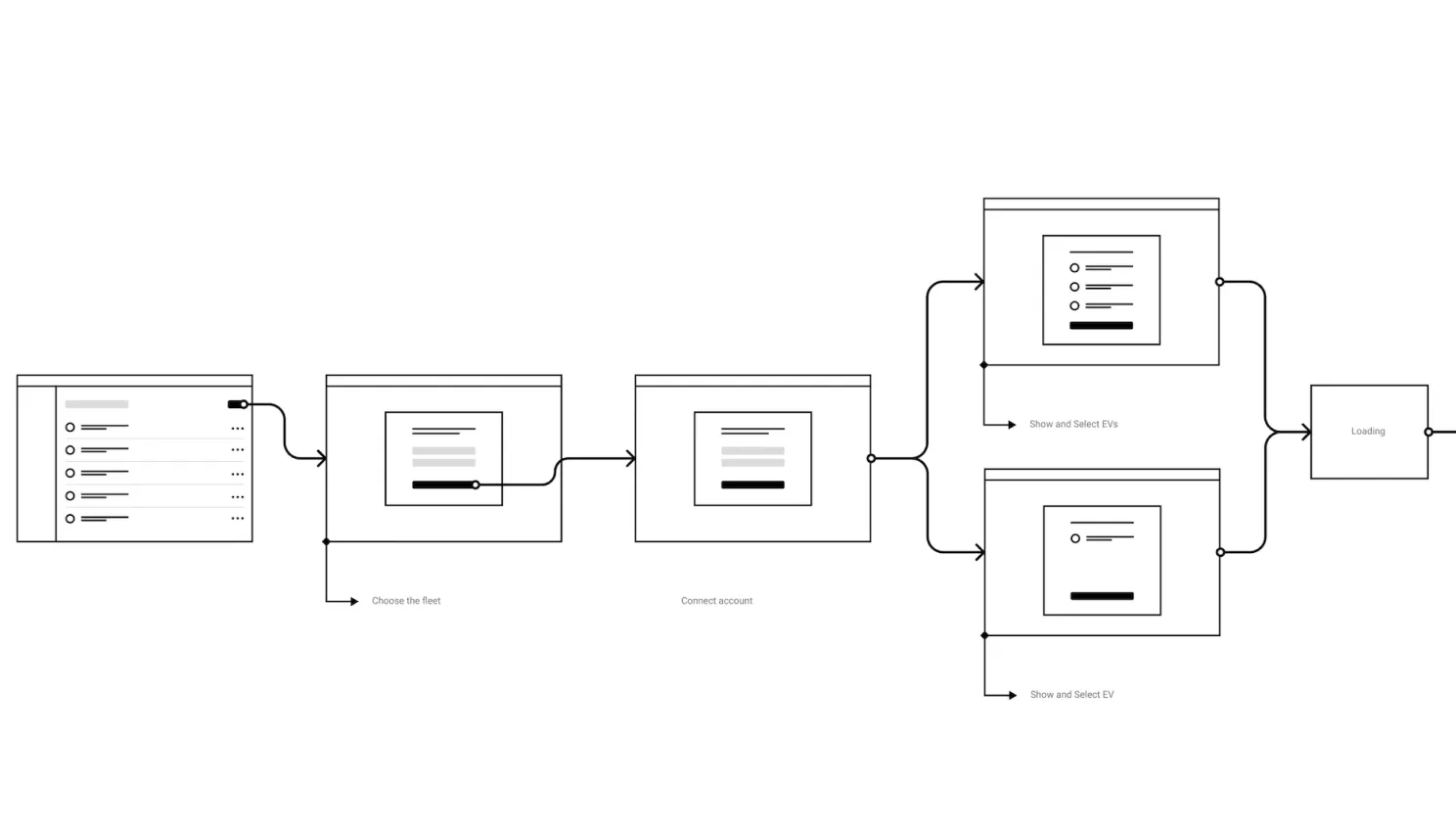
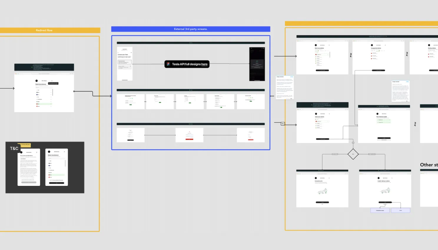
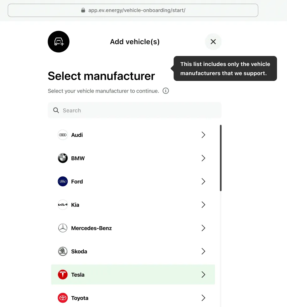
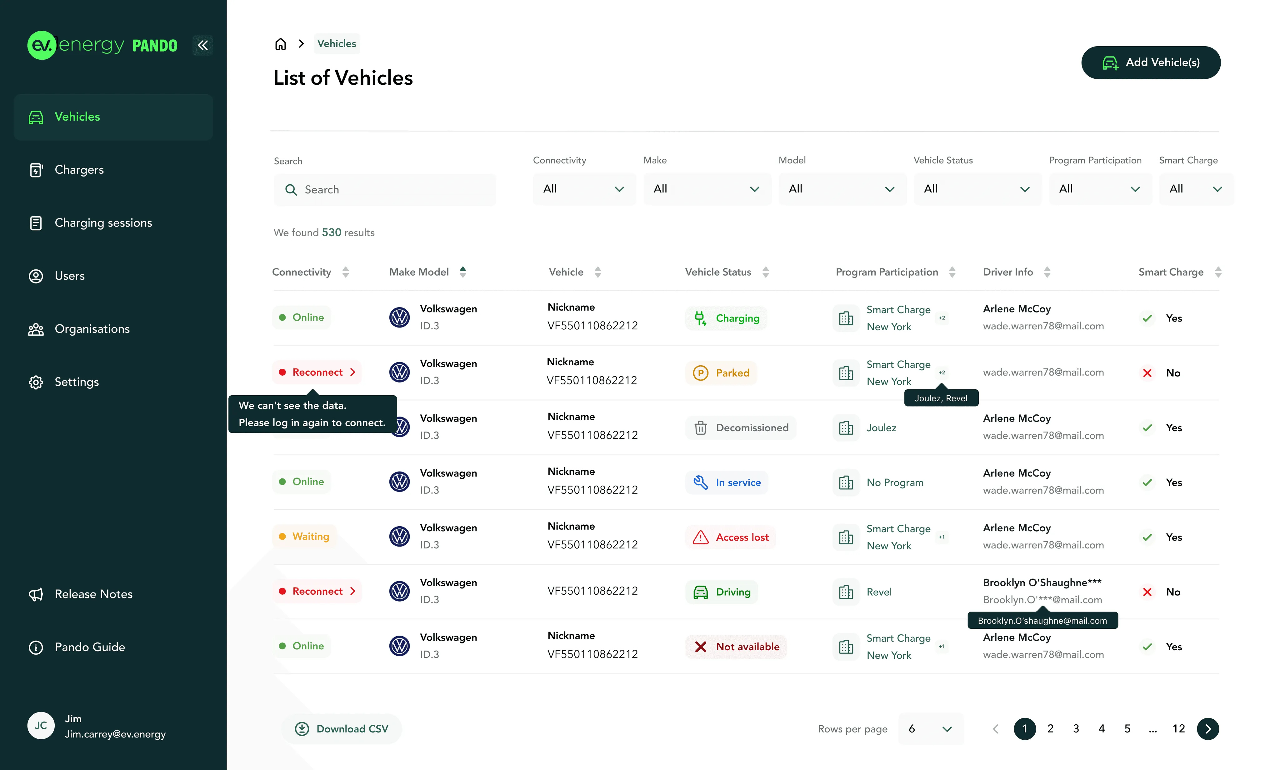
ev.energy provides a fleet dashboard for B2B organisations to manage their electric vehicle (EV) fleets. Fleet managers encountered challenges during the vehicle onboarding process, including poor data accuracy and limited visibility. This project aimed to streamline the onboarding experience, making it simpler, more intuitive, and more transparent.

Role

I led the end-to-end redesign, from user research and wireframing to prototyping and developer handoff documentation.

Tools

Figma, Miro, Maze, Jira, Hotjar

Timeline

2022

Team

Product Designer, Product Manager, Engineering, Fleet Operations, Customer Success.

Platform

Web dashboard

Problem statement

Fleet managers face significant inefficiencies in the onboarding and monitoring process for vehicles in the ConEd SCNY program.

Key issues include:

  • Vehicle data is unintuitive and often inaccurate.
  • Lack of clear telemetry data status, causing fleet managers to miss when telemetry access is lost.
  • Utility program participation status is missing, making it difficult for fleet managers to track program participation.
  • Vehicles are hard to identify, slowing down workflow and creating errors in fleet management.

Project goal

The goal was to onboard new vehicles more efficiently with streamlined data relationships and create a functional vehicle listing page that provides clear data and easy identification for fleet managers.

Key metrics to measure success:

  • Decrease the time required to onboard a vehicle by 30%.
  • Increase user satisfaction with the vehicle list page by 25% (measured through user surveys and feedback).

Research

  • User Interviews: Conducted 5+ interviews with fleet managers to understand key frustrations.
  • Telemetry & onboarding workflow analysis: Mapped current processes to identify major gaps in data visibility and usability.
  • Benchmarking: Studied 3 competitor fleet management platforms to identify best practices in vehicle listing, onboarding, and telemetry data presentation.
Research 1Research 2

Key friction points

  • Fleet managers need more transparency in vehicle data, specifically regarding telemetry status and program participation.
  • Vehicles without clear identification or data access indicators cause errors in vehicle assignment and management.

Design Process & Iteration

  • Ideation: Brainstormed solutions for data clarity and improved vehicle identification. Focused on simple, intuitive design changes.
  • Wireframing & Prototyping: Developed low-fidelity wireframes for rapid iteration based on early feedback.
  • Usability Testing: Conducted 3 rounds of testing with fleet managers to validate and refine the design, ensuring all key features were met.
Wireframe 2Wireframe 1

Improvements

  • Onboarding Workflow: Streamlined data relationships between B2B organisations, vehicles, and users to improve vehicle onboarding speed.
  • Vehicle Identification: Added vehicle names and make logos for easier identification.
  • Telemetry Data Visibility: Introduced clear indicators showing when telemetry data is lost.
  • Utility Program Participation: Added an indicator to clearly show which vehicles are part of a utility program.
  • Intuitive Data Presentation: Redesigned the Vehicle Data column for better clarity and usability.
Fleet Onboarding
Fleet Dashboard

Outcome

  • +30% increase in user satisfaction, exceeding the 25% target.
  • 35% faster onboarding, meeting the efficiency goal.
  • 95% accuracy in program tracking, up from 70%.